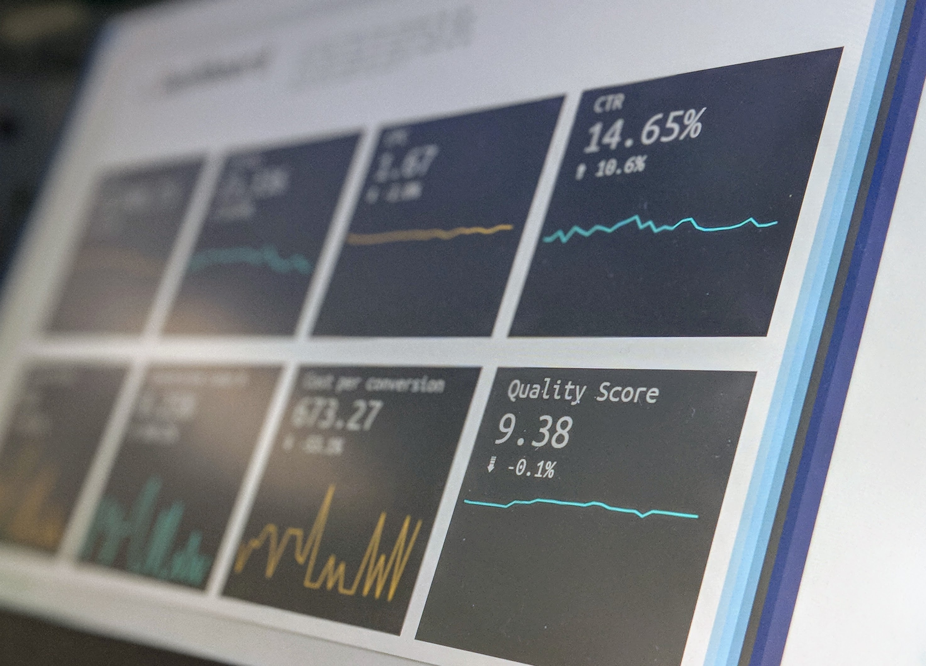
 Photo by Stephen Dawson on Unsplash
Interactive dashboards are revolutionizing the way data is explored, analyzed, and presented. In the world of data-driven decision-making, these powerful tools provide an intuitive and engaging interface for users to interact with complex data sets and gain valuable insights. Python, being one of the most popular programming languages for data analysis and visualization, offers a range of libraries and frameworks to create interactive dashboards. In this post, we will explore some of the top Python libraries for building interactive dashboards. Whether you are a data scientist, a business analyst, or a developer, these Python libraries will empower you to create compelling visualizations and drive data-driven decision-making.
Streamlit has garnered a lot of attention since they were purchased by Snowflake a little over a year ago, and rightly so. It occupies the space right above Jupyter Notebooks in going from code to plots, forms, and widgets relatively easily with minimal code. Compared to the other libraries on this list, the API is extremely simple and intuitive. Knowledge of React is needed to create custom components since it’s used under the hood. If you don’t want to go that route, just pick one from many built from a very active community. They also have Community Cloud where you can deploy, manage, and share your apps for free.
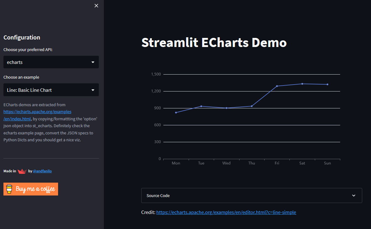
The biggest drawbacks when using Streamlit.
That said, I still use it to prototype since it offers the fastest development time.
Solara is another Python library using React under the hood. However, unlike Streamlit which renders each React component independent and ties it to a Streamlit call, Solar is based on Reacton, which is a Python wrapper around the React framework. This benefits this framework by allowing the rerun of only affected components versus the whole page in Streamlit.
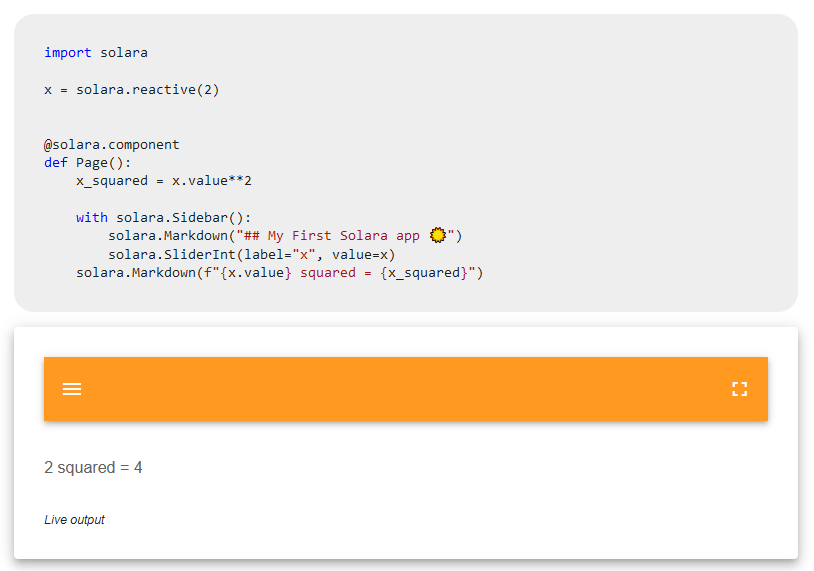
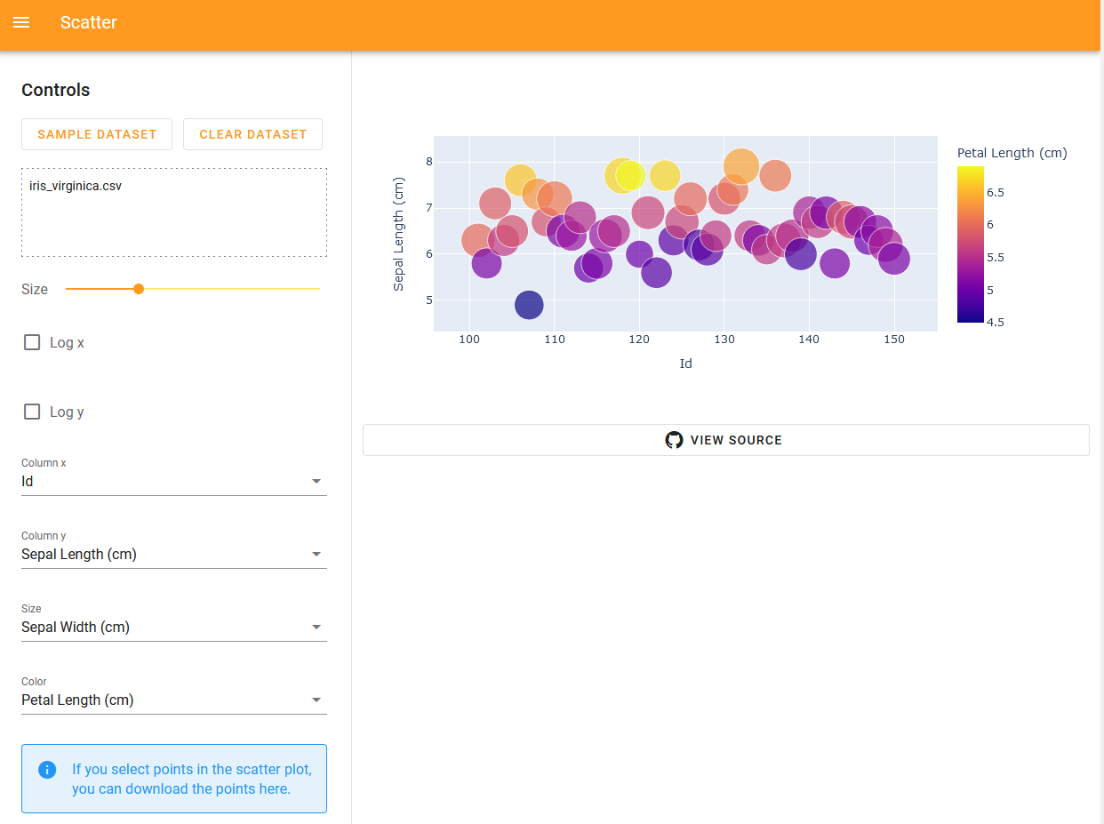
Plotly Dash is an interactive dashboard framework built on Flask, Plotly.js, and React.js. It provides a high-level declarative syntax and supports interactive components like graphs, tables, and dropdowns. There is an enterprise edition that offers additional features; however, the active community provides a number of additional components libraries. Dash mainly uses server-side rendering like the previous entries, but it also includes the ability to ship Javascript in what they refer to as clientside-callbacks. This allows you to save the back-and-forth latency between data transformations by allowing your client to handle all the manipulations and filterings. It can even open your dashboard to use other Javascript libraries without creating a custom component. Like Streamlit, creating components requires an understanding of the React lifecycle. In general, though, callbacks are how Dash creates its reactive elements.
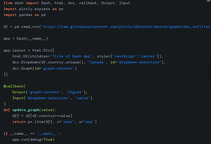
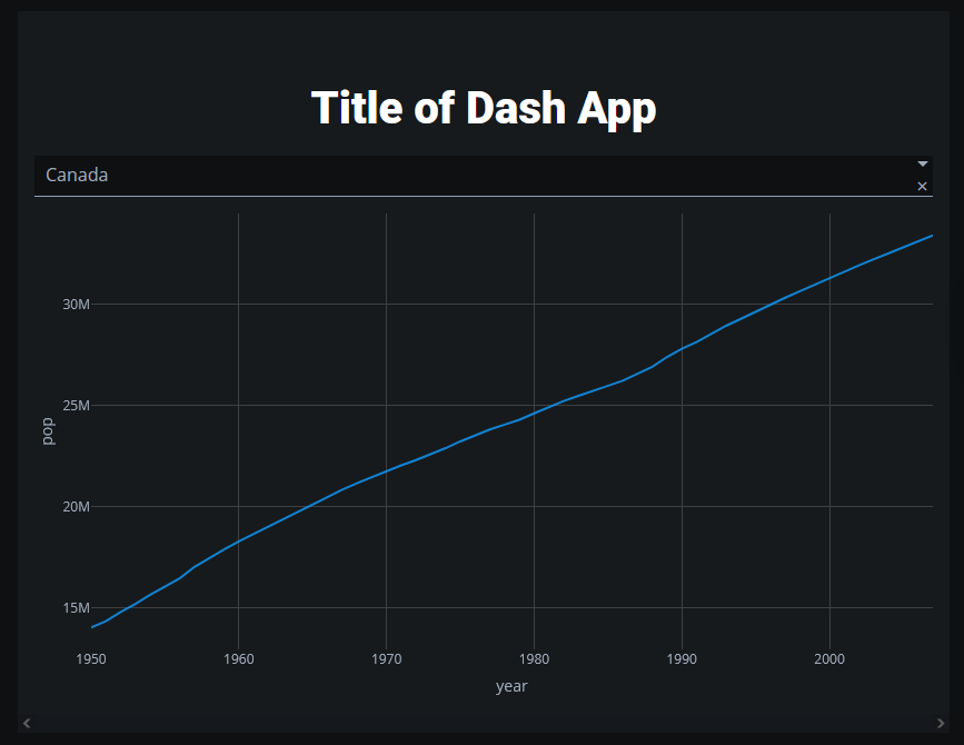
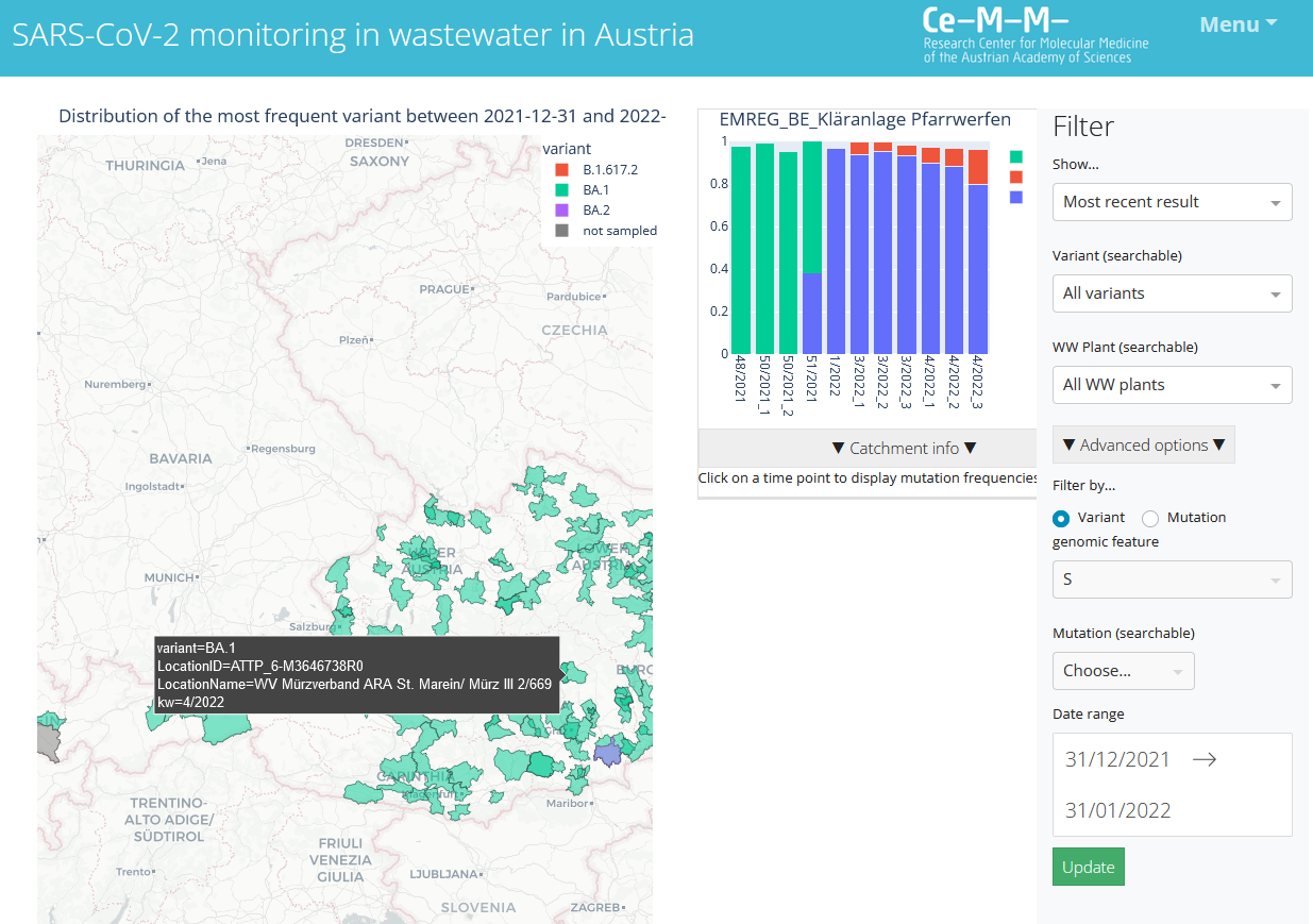
Notice the pseudo-HTML in the first image made available by the HTML class. One of the parameters is style which lets you add in-line styling if need be. Part of that is the ability to use classes that you can take from TailwindCSS. The only thing I wish is the plots had more customization. You can when using Plotly.js directly; however, it’s lacking some options when creating plots in Python.
Yup, Posit (formerly RStudio) has made available their dashboard software in Python.
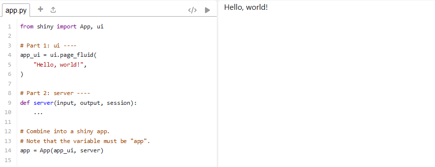
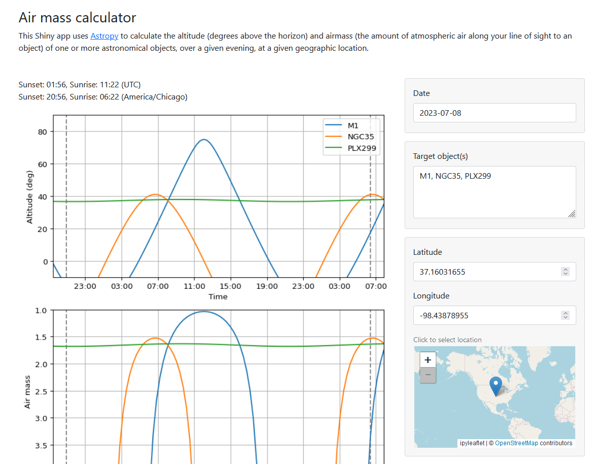
I haven’t had the chance to use this in Python as this and Dash occupy very similar spaces. Instead of React, however, Shiny uses jQuery to create its reactive values. I also like that their HTML interface allows the use of CSS files, which lets me use Tailwind.
Datasette is a tool for exploring and publishing data. I’ve never had the chance to use this tool; however, their approach is really interesting. It aims to make the whole ordeal of interacting with data streamlined and accessible. Like the other tools in this list, it allows the user to take data, analyze it, and publish it as an interactive website. Where it differs is that it not only opens the data sets as API endpoints, but also lets you edit the queries that influence the visualizations. The datasette-dashboards plugin is still an experimental feature; however, it stays true to its approach by using YAML to simplify the code needed to create these plots.
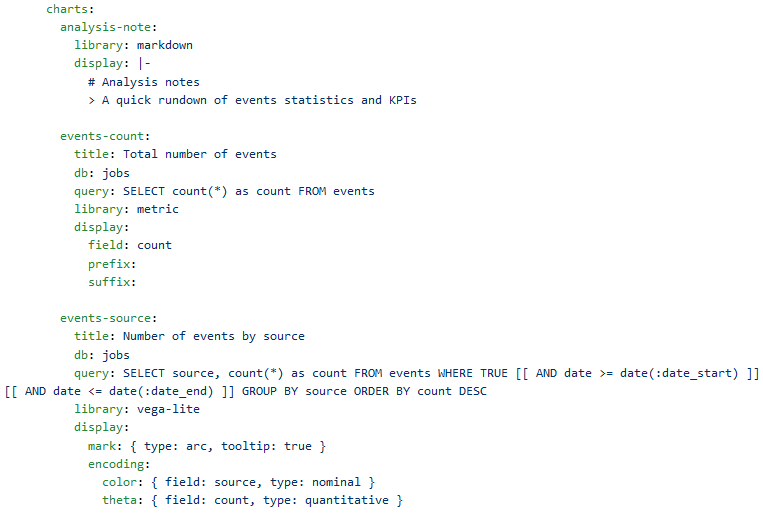
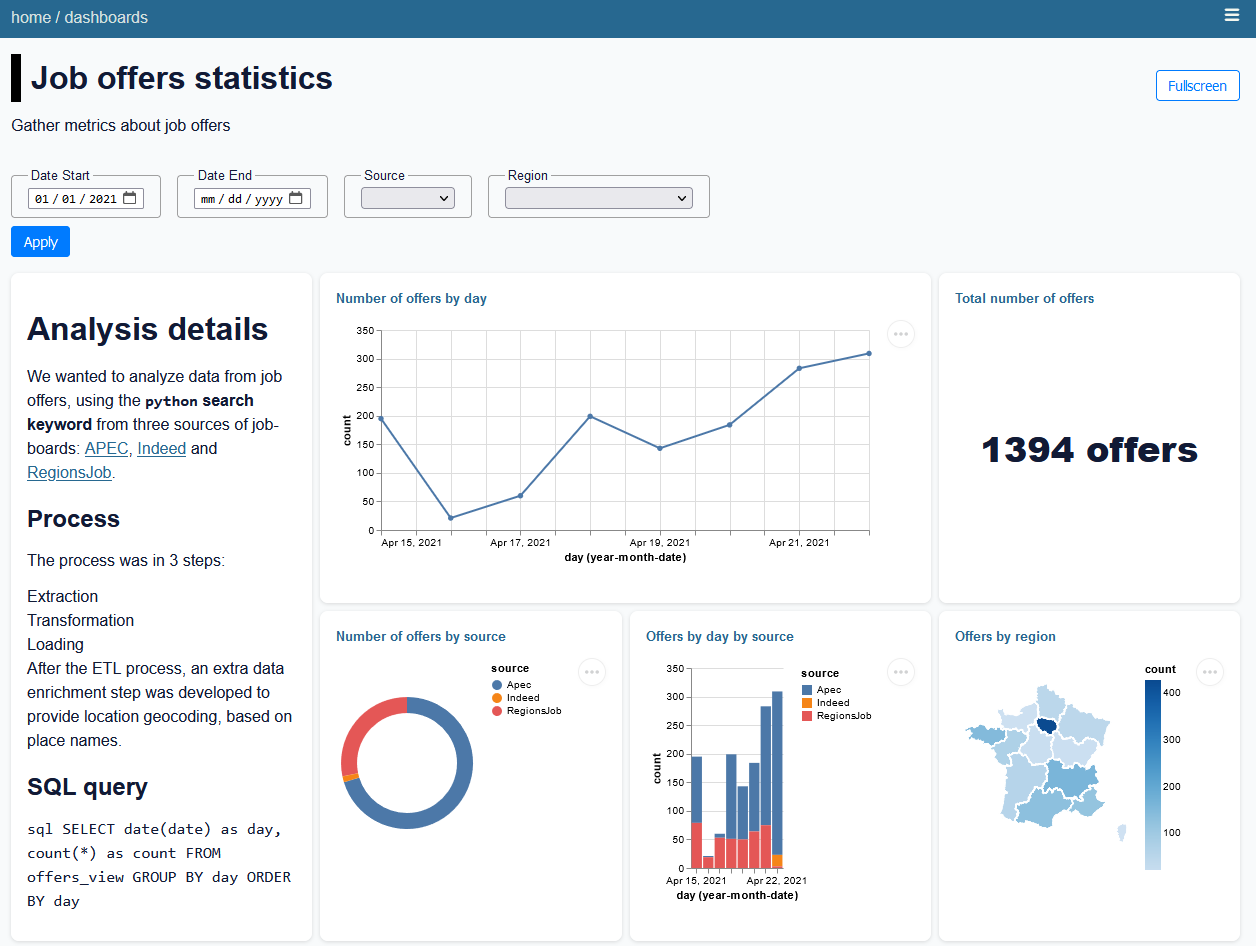
The underlying visualization libraries are Vega/Vega-Lite. Datasette can be deployed to traditional and serverless hosting platforms.
The last option is a catch-all for all the available web frameworks like Django, Flask, and all their async derivatives. These work by either developing a complete web page in HTML/CSS/JS or using that markup along Jinja to create a template. This is the current method I prefer alongside Astro, which opens up the door to both Javascript visualization libraries like Echarts.js and client-side data manipulation and computation.
My tooling went full circle to arrive back at Flask, which was my first introduction to creating dashboards with Python. Easier tooling like Streamlit and Dash made it possible to side-step all that development time to a deliverable at the cost of some customization and client-side computation. The look largely feels the same since it’s either built on React one way or another, or it uses the more common component libraries that are ported over to Python. My endgame as of late has been the use of Astro in combination with Echarts to easily create these static sites I can integrate with an API.
Another avenue to create interactive visualizations is to use Jupyter Notebook alongside a visualization package. Some Python libraries that might help you out here are: